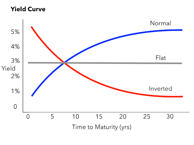
A yield curve is a graphical representation that plots the yields or interest rates of bonds with similar credit quality but different maturity dates. In simpler terms, it shows the relationship between the interest rates and the time it takes for bonds to mature. The curve can take various shapes, such as upward-sloping, downward-sloping, or flat, each indicating different economic conditions and expectations for interest rate changes.
A yield curve is like a roadmap for bonds, showing the interest rates for bonds of the same credit quality but with different maturity dates. It's an essential tool for predicting future interest rate shifts and gauging economic trends.
Yield curves typically come in three shapes: normal, inverted, and flat, each telling a unique story about the economy's health.
Using a Yield Curve
Investors keep a close eye on the yield curve as it serves as a benchmark for various debt instruments, like mortgage rates and bank lending rates. By charting a yield curve on Excel, investors can visually track the curve's movements and spot trends.
One of the most commonly observed yield curves compares the yields on various U.S. Treasury debts, ranging from three months to 30 years. These rates are readily available on the U.S. Department of the Treasury's website, updated daily.
Types of Yield Curves Normal Yield Curve
One of the most commonly observed yield curves compares the yields on various U.S. Treasury debts, ranging from three months to 30 years. These rates are readily available on the U.S. Department of the Treasury's website, updated daily.
Types of Yield Curves Normal Yield Curve
Picture a line sloping upwards; that's what a normal yield curve looks like. It indicates that short-term bonds have lower yields compared to long-term bonds. When the economy is expanding, long-term bonds usually offer higher yields.
For instance, a two-year bond may have a 1% yield, while a 10-year bond might offer 2.5%.
For instance, a two-year bond may have a 1% yield, while a 10-year bond might offer 2.5%.
Inverted Yield Curve
Now, flip that line downwards. An inverted yield curve suggests the opposite scenario: short-term bonds have higher yields than long-term ones. This phenomenon often precedes an economic recession as investors flock to long-term bonds in anticipation of lower future yields.
A flat yield curve, as the name suggests, is a straight line. It occurs when the yields on short-term and long-term bonds are almost identical. This scenario usually points to economic uncertainty.
U.S. Treasury Yield Curve
A flat yield curve, as the name suggests, is a straight line. It occurs when the yields on short-term and long-term bonds are almost identical. This scenario usually points to economic uncertainty.
U.S. Treasury Yield Curve
This curve tracks the yields of short-term Treasury bills against long-term Treasury notes and bonds. It's essentially a visual representation of the relationship between interest rates and the maturities of U.S. Treasury securities.
Understanding Yield Curve Risk
Understanding Yield Curve Risk
Yield curve risk is what investors in fixed-income instruments face when interest rates shift unfavorably. Since bond prices and interest rates move in opposite directions, a rise in rates leads to a drop in bond prices and vice versa.
Making Sense of the Yield Curve
Making Sense of the Yield Curve
Investors use the yield curve to forecast economic trends and guide their investment decisions. For instance, if the curve indicates an economic slowdown, investors might shift their funds to defensive assets. Conversely, a steep curve might signal future inflation, prompting investors to avoid long-term bonds susceptible to value erosion.
In essence, the yield curve acts as a crystal ball, offering insights into future economic conditions and helping investors navigate the financial landscape.
In essence, the yield curve acts as a crystal ball, offering insights into future economic conditions and helping investors navigate the financial landscape.

